


Ink Review : TWSBI 1791 Sky Blue 蘅芜

TWSBI 1791 (Sky Blue) 蘅芜 (pronounced “Heng Wu”)
Hello there! Now that the sun is out and skies are blue, we thought we’d review SKY BLUE from the TWSBI 1791 ink series.
Why is there “1791” in this series of TWSBI inks:
The inks in the TWSBI 1791 series are inspired by the epic novel “Dream of the Red Chamber” (also known as “Story of the Stone”).
The numbers 1791 stands for the year the novel was written, authored by Cao Xueqin. The 1791 inks are sold separately or as a set of 6 colours – each with a Chinese name that alluded to notable architecture or places of interest within the book.
Background information about the name of the ink:
The ink is named after the place of residence of Madam Xue Bao Chai (cousin of the male lead, Jia Baoyu). Most of the architecture in the story had a name, which was depicting of the times. The ink name is Heng Wu 蘅芜, short for Heng Wu Yuan 蘅芜苑- which the author deliberately planned to make it sound like the word “fateless” (恨无缘).
This architecture may look bare and bland on the exterior, but a hidden elegance awaits when you enter her abode. Whilst Xue Bao Chai eventually got her wish of marrying her beloved cousin, Jia Baoyu, the latter only has eyes for Lin Daiyu (the female protagonist). This rendered their marriage a loveless one, adding to the melancholic tone of the epic novel.
The physical appearance of Residence Heng Wu Yuan: icy cold, aloof, much like its owner, whose true emotions are never worn on her face. According to the story, there is also a strange plant grown within the residence, which thrives on icy temperatures for vast blooms.
Back to the ink:
If you are not a fan of Chinese literature or the drama fanfare, fret not. I am going to talk about the ink itself.
With the hot sun blazing over our heads these days, I think this icy blue color in the ink brings about a refreshing whiff of cold relief for a hot day, pleasant to look at, and stands out with its vibrant color.
I like it for its medium wetness, and it shows rather consistently regardless of white or beige paper. Compared to the Ama Iro from the Pilot Iroshizuku, the TWSBI Sky Blue has more yellow pigment, so it is a light blue that presents quite prominently on paper. It looks darker than the Ama Iro, and closer to the turquoise family. Another ink I compared it with, was the Ebisu from Pilot 100th Anniversary range. The Ebisu is a powdery light blue, lighter than Sky Blue. Having said that, all 3 colors show fantastically well on paper, each with their own allure. Comparing the scripts from all 3 inks, TWSBI 1791 Sky Blue sits right in the middle.
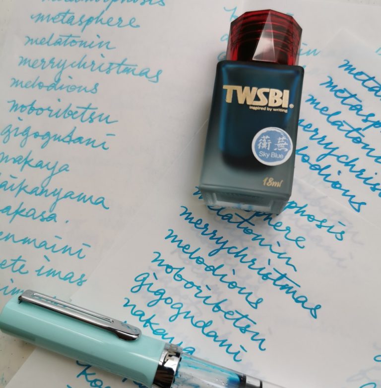
Image from: @missmuffat
For those of you who love peacock blues, the TWSBI 1791 Sky Blue is the start of that color scale.
All in all, this ink sparks interest whilst still viable for everyday use. If you are still grumbling about blues, blacks for everyday colors, I have something for you in the next few posts, but hey, it’s 2020 – we can get a little wilder with our everyday choices!
Comparable with
Pilot Iroshizuku Ama Iro
Pilot 100th Anniversary Ebisu
What I used:
TWSBI Limited Edition Mint Blue, Broad Nib
Paper: Muji notecard, Bestform notecards
(Scale of 1 to 5)
Dry time – ★★★★★ (1=slow, 5=fast)
Flow – ★★★★☆ (1=dry, 5=wet)
Shading – ★★★★☆ (1=low, 5=high)
Thanks to @missmuffat for this review.
Leave a comment