


Unboxing Leuchtturm1917 Rising Colours Notebooks (2021)

We’ve been waiting all year for the reveal of Leuchtturm1917’s new colour range and wow did they not disappoint! The new series, titled ‘Rising Colours’ are a stark contrast to the more pastel colours of the previous year’s ‘Muted Colours’ range.
Breaking New Grounds
It’s no surprise that most of us are looking forward to the coming year in hopes of a newer and brighter future as 2020 hasn’t exactly been what we had hoped it to be.
The colours featured in the ‘Rising Colours’ series remind us of all good things about the Earth: Sunshine, oceans and nature.

While the beautiful colour tones definitely played a part in inspiring the name ‘Rising Colours’, there’s actually a deeper meaning to it.
‘To rise’ means to ascend, break up and grow. Through this series, Leuchtturm1917 hopes to encourage users to free and explore their thoughts for a new beginning, gather inspiration and arise. The poetic message behind this series is something that will resonate with those who feel discouraged by the year’s events.
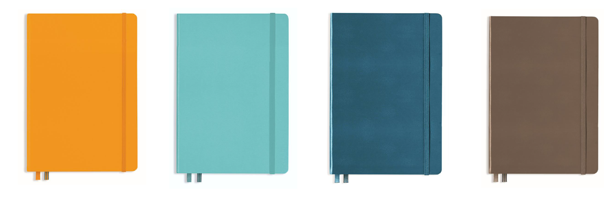 Nature Inspired: Rising Sun, Aquamarine, Stone Blue and Warm Earth. (Left to Right) (Image by Leuchtturm1917)
Review of Leuchtturm1917’s Rising Colours
Besides the new colours, there isn’t much of a difference to the Leuchtturm1917 journals and of course, that’s not a bad thing.
To give you a breakdown, each notebook includes:
- 251 numbered pages
- 8 perforated and detachable sheets
- Gusseted pocket
- Blank table of contents and numbered pages
- 2 Page markers
- Elastic enclosure band
- Thread-bound book opens flat
- Fountain pen friendly paper (80 g/sqm)
- Sticker for labelling and archiving
The brand’s renowned paper quality is passed down to the new journals and we decided to put it to the test in today’s review. To start, we used a Karin brushmarker PRO. For those who watched our last video, you’ll know that Karin brushmarkers are extremely juicy and pigmented. So the question was, how would Leuchtturm1917’s paper fare against it?
 Fountain Pen Friendly: The paper holds well against inks like 3 Oysters and Kyoto Ink with no bleed appearing on the opposite side of the page.
A single stroke applied shows through the paper a little while double applications or more increases the bleed visibility. Our next contender was a TWSBI fountain pen. As expected, the bleed was almost non-existent. For that, we would recommend users to skip heavyweight markers like the Karin brushmakers unless you don’t mind some bleed showing through.
 Match Made in Heaven: The matching Drehgriffel pens and pen loops are the perfect accessory to your new journals. (Image by Leuchtturm1917)
Each notebook comes in Leuchtturm1917’s best selling size: A5. You can take your pick from either the ruled, dotted or blank formats depending on your preference. We recommend the ruled for writing, the dotted for bullet journaling and for more freedom in writing or sketching, the blank. Let us know which you’ll be getting and in what colour!
Psst, for fans of Leuchtturm1917’s newly released Drehgriffel pen, you’ll be thrilled to know that matching colours of the pen and pen loop will be available mid-November online. Look out for our update! In the mean time, check out our review of the Drehgriffel here.
Rise up and grow towards a better 2021 with Leuchtturm1917’s new ‘Rising Colours’ today!
Watch our full review here:
Leave a comment